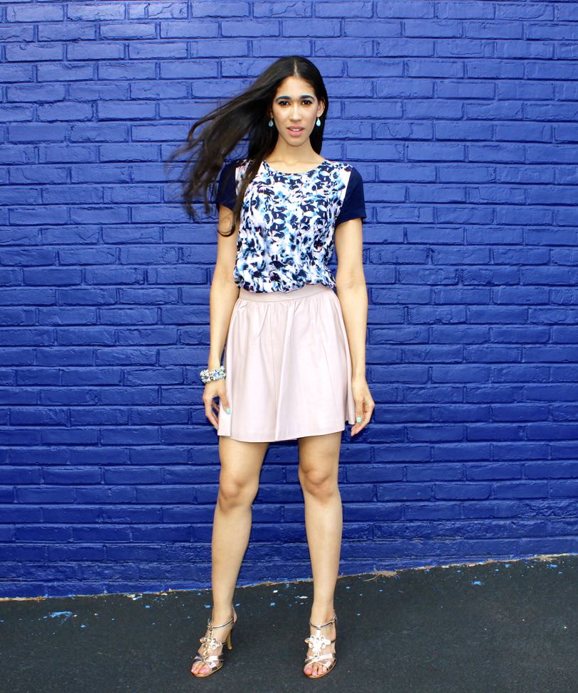
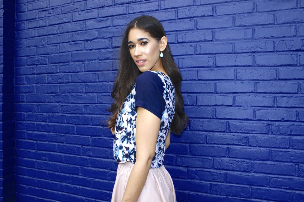
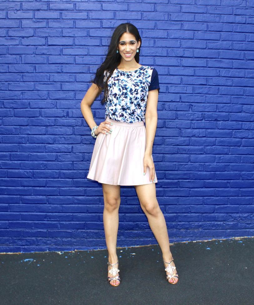
GET THE LOOK!
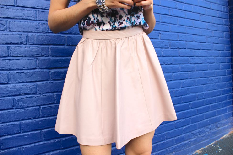
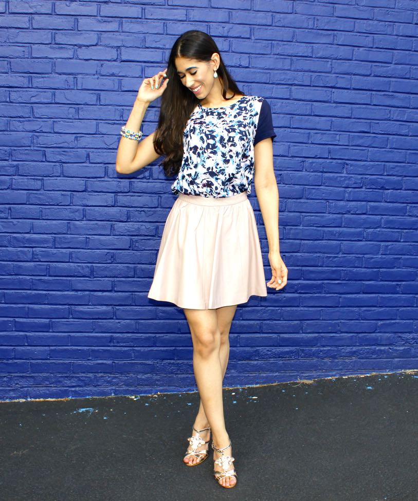
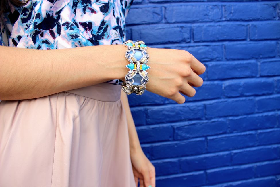
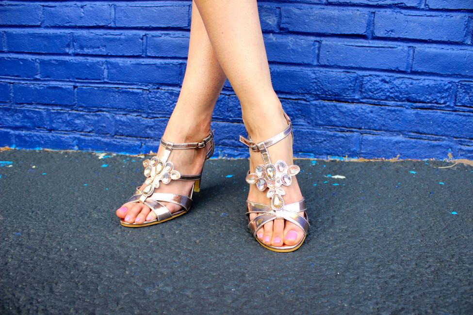
Top: Cynthia Rowley (similar ON SALE HERE) // Skirt: H&M (similar HERE) // Earrings: What Would V Wear Collection (HERE) // Bracelet: Alexis Bittar (similar ON SALE 50% OFF HERE) // Sandals: similar HERE

Happy Hump Day, friends!
I hope you're all having a great week so far! Today's outfit features a feminine and classy color combination which I adore, blue and blush. As you all know, I love pink, actually I'm quite obsessed! In recent months, I've been reaching for nearly all of the the pink pieces in my wardrobe, many of which I didn't even know I had in the color! Since I've been reaching for them so often, I've been looking for ways to combine them with other colors and I've found that all shades of blue look absolutely beautiful against one particular shade of pink, blush! It all depends on the mood or vibe you wish to create when putting together your outfit, since different shades produce different vibes. For example, navy or darker shades of blue are more sophisticated and would be a great option to combine your blush piece with for the office or in a more professional setting. Lighter shades, such as serenity blue or turquoise have more of a soothing or tranquil vibe, so they're more relaxed.
As you can see, the floral tee I'm wearing features both navy and turquoise shades, as well as a hint of blush within the pattern. I decided to pull out both the turquoise and blush by wearing these gorgeous turquoise colored earrings, which are another beloved piece of mine from Vanessa's beautiful jewelry line, What Would V Wear Collection, which I mentioned in Monday's post, as well as a blush pink leather skirt. This is something I do quite often when working with one printed piece, I pull out a couple of the colors found within the pattern to equally distribute the colors in the entire outfit. At the same time, I'll also throw in a wild card with an unexpected color because I feel it works well with all of the others in the pattern, but sticking with the presented colors is definitely a fool proof, no fuss way of working with patterns. The more colors the pattern has, the more options! I've styled this top in so many ways here on the blog, two of which you can check out here and here.
What do you think of the look? I hope it inspired you to create some outfits using various shades of blue, instead of just the serenity we've been seeing a lot of this season. Since Pantone announced that both serenity and rose quartz were the official colors of the year, we've been seeing them styled quite often. Although the duo is indeed lovely and one I also enjoy wearing, I encourage you to have fun and mix other shades for a more unique and less trendy combination. Thanks so much for stopping by and I hope your day is as fabulous as YOU!
XO,