Happy Thursday my gorgeous friends!
How do you all feel about Pantone's selection for the color of the year 2017? If you don't know, green has been chosen and not just any green, a somewhat of a lime green shade. The reason it was chosen is to signify new beginnings and revitalization. Quite inspiring, huh?! Well, I understand that not everyone may be fond of this shade, though I can't say I mind it, it's quite pretty if you can think outside of the box.
Generally speaking, Pantone typically announces a particular shade of a color that will signify or set the tone of the year fashion-wise. Often times, we see so many options in the shade than we typically do, but also in the color family it belongs to as well. So, if you're not too fond of the lime green shade, I'm presenting you with a commonly loved alternative perfect for spring, olive green.
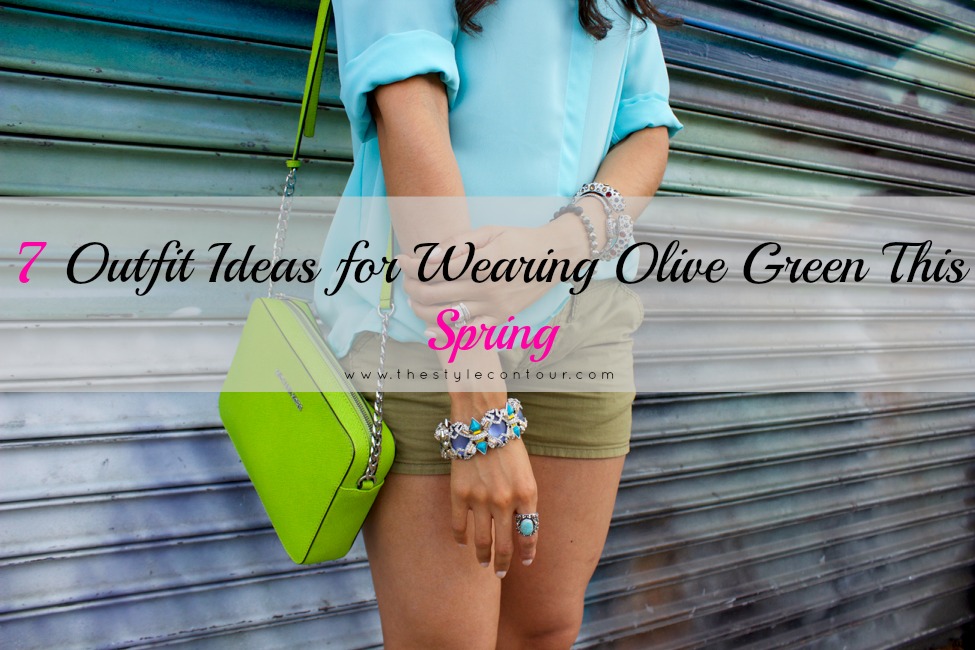
Olive green is a beautiful shade to transition with since it has an earthy and refreshing vibe, synonymous with nature and the greenery we begin to see grow and blossom during the season. Today, I'm sharing a little #throwback compilation with 7 outfit ideas for wearing the shade in a way that perhaps you've never thought of with a mix of color options and of course, some patterns thrown into the mix; they wouldn't be my outfits if there wasn't a pattern found in at least one outfit, right?! Let's get started...
Olive + Grey + Orange (+leopard print)
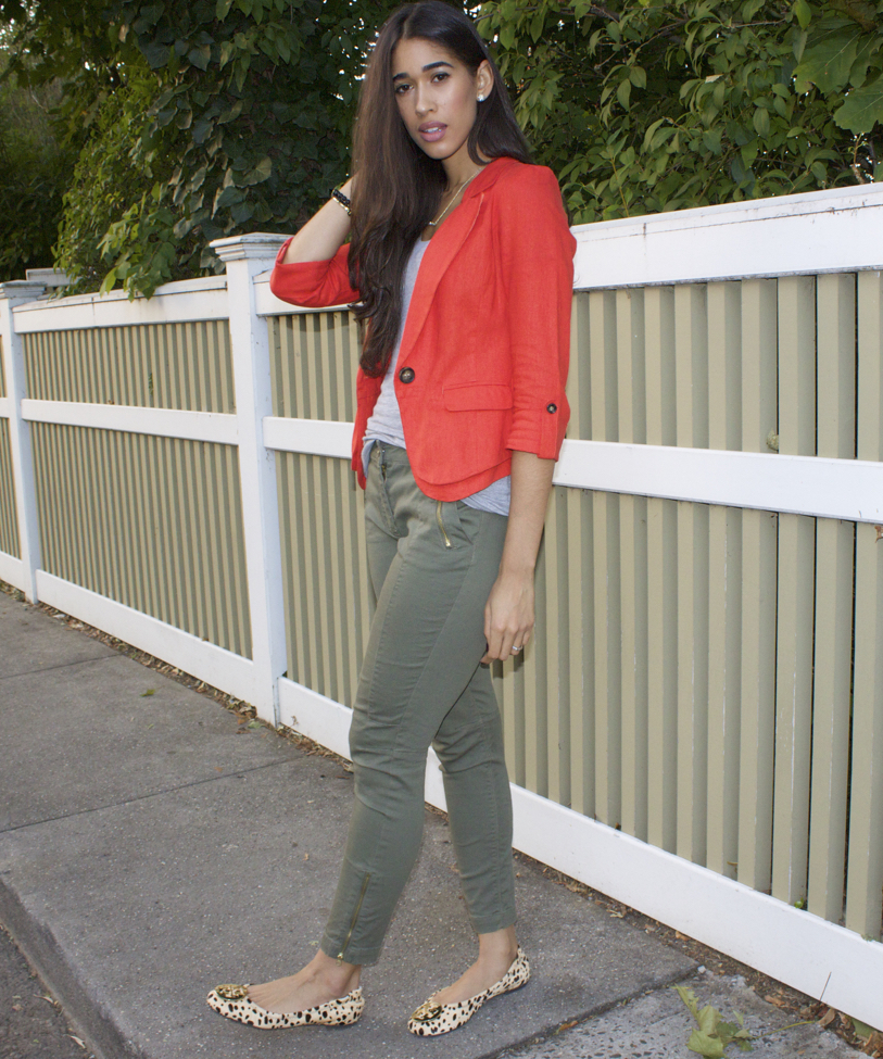
I remember the day I first stumbled upon an outfit worn my Jessica Alba that contained all three color colors and fell in love! I obviously loved it so much that I recreated it myself, but with my own spin of course by adding a little leopard print ;) You can totally ditch the leopard, though, and add perhaps a pair of trendy Adidas Superstars? If you have cool undertones and don't typically reach for olive green shades, the grey tee will help offset everything and make it more flattering on your skin tone, so do give it a try!
Lavender + Olive + Taupe (+camel brown)
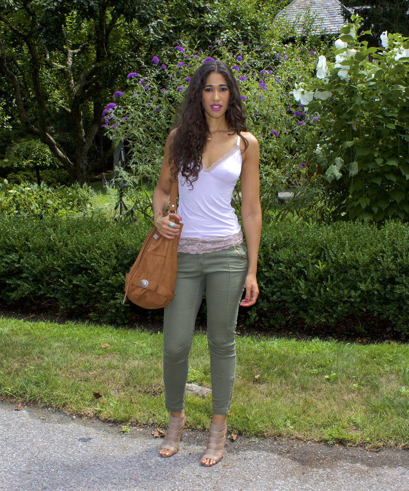
Who knew purple would look so good paired with green? For those of you who aren't into the bold color blocking outfits combining saturated purples and greens, this is a perfect alternative to combining the colors. You see the different effects shades can have? I also love the way the two look combined with taupe as well. You can opt to add in a rich brown colored piece, such as purse or pair of wedges, if you want to add some saturation to the look. If you wish to keep the outfit a bit more muted, I'd suggest you skip the brown and just opt for taupe.
Fuchsia + Olive + (bxw) Stripes
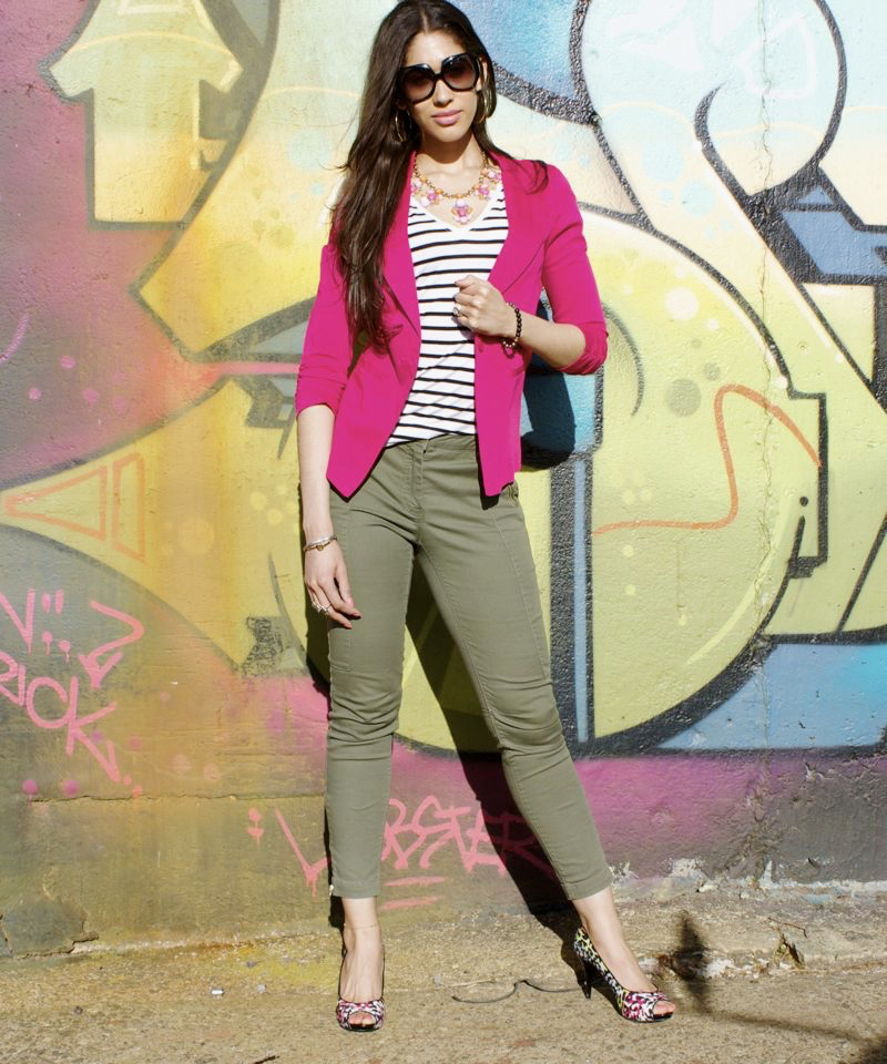
I love the way a bold pink shade looks teamed with olive, I feel it creates a fun and exciting duo and the stripes add a nice component as well. I got a little funky and added in a pair of rainbow leopard pumps because why not? You can obviously replace them with a pair of beige pumps to tone down the volume just a teeny bit ;)
Blush Pink + Olive
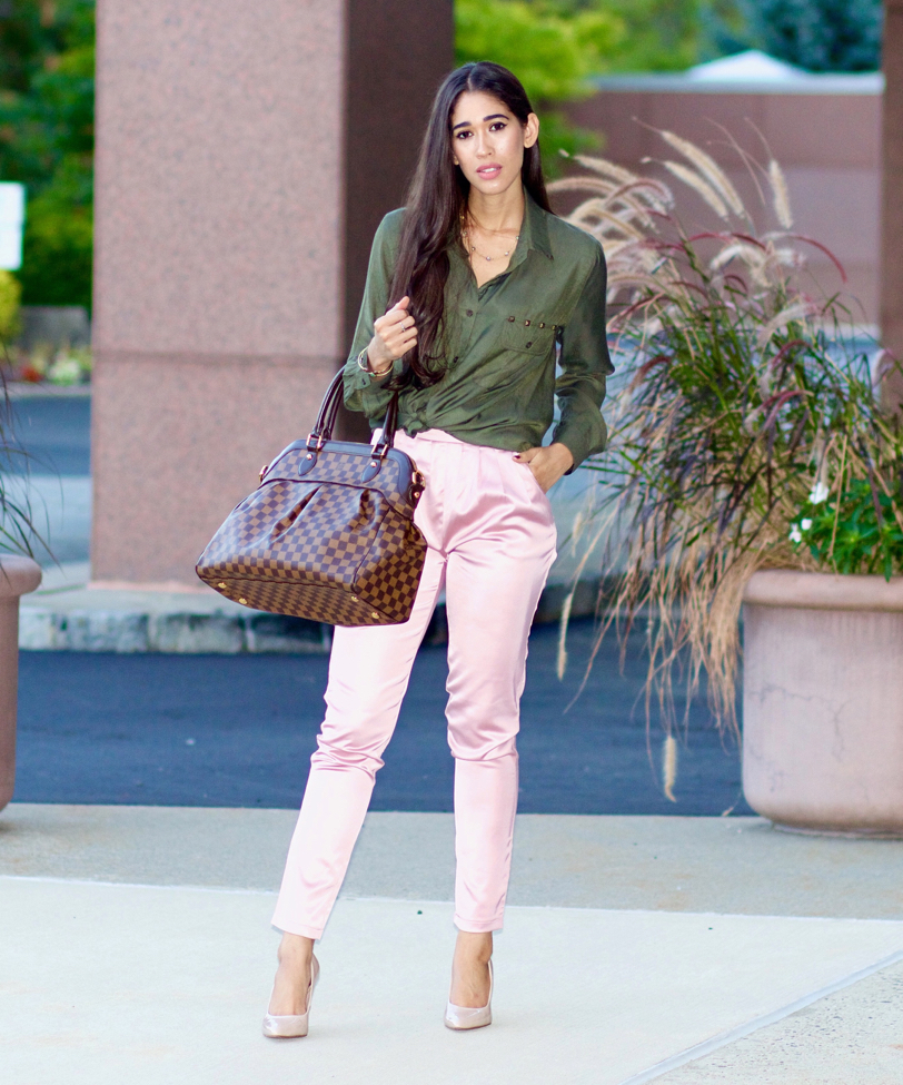
If bold pink shades aren't your jam, opt for the trendy blush pink! This combination is so pretty and gives off somewhat of a juxtaposition vibe, since the olive green is typically associated with military pieces and the light pink is uber soft and feminine, so good!
White + Olive + Red (+camel brown)
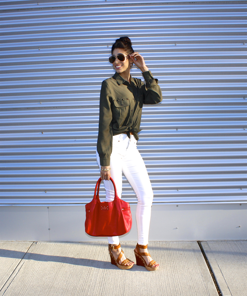
I've mentioned a number of times since the start of fall that I don't believe in restricting ourselves to wearing white only during the summer months, the whole no white after Labor Day "rule" is quite ridiculous if you ask me! But, since this is the time of year that we start to see white jeans worn the most, I think this color combination is perfect for transitioning, especially into summer. I don't know why, but this combination screams later spring to me, though it can certainly be worn now, I guess it's the vibrant red and gold aviators that are adding those bronzy summer vibes?!
Black + Olive + Camel Brown
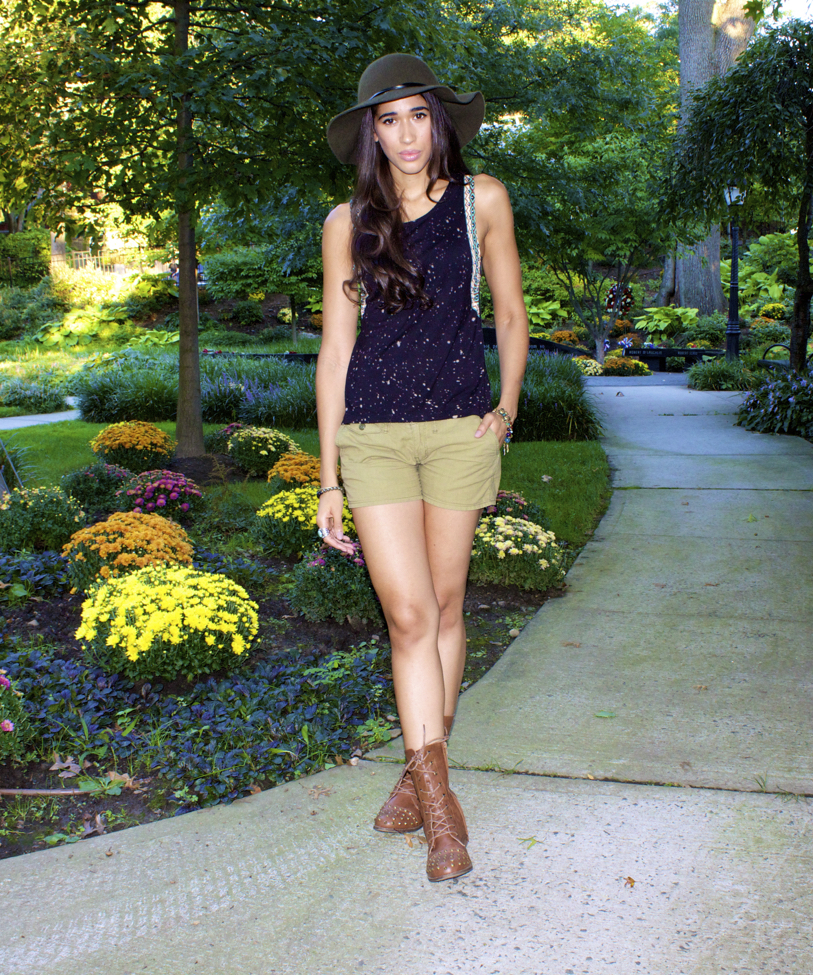
This trio screams boho to me and particularly in this outfit with the pieces combined, which I think would be a super cute outfit idea for the many festivals coming up! It's a very earthy combination with not much color, yet something about it is still interesting enough to make it note worthy.
Aqua/Mint Green + Olive (+neon green + holographic)
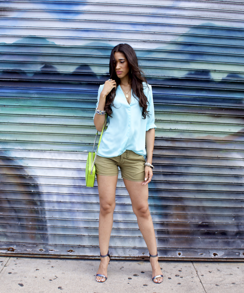
This has got to be my most favorite combination! I absolutely LOVE the way the aqua/mint shade looks against the olive green, it's so refreshing and reminds me of a tropical getaway that I wish I was on right about now. Usually olive green pairs best with gold accents, but since the aqua shade is a cool toned color, it permits for the use of silver accents without being thrown off or clashing, so this would be a perfect option for all my cool toned beauties. If you have fair skin and light hair (platinum blonde or red) this color combination will make you GLOW, honey!!!!
I hope you all found inspiration from these outfits ideas! Some color combinations you may have seen before, others perhaps not. Remember to think outside of the box and that because you may not like a combination at first glance, doesn't mean you should write it off entirely. Often times it's the pieces themselves that can really enhance the beauty of combination, so open that closet of yours and start experimenting!
Thanks so much for stopping by, my dear friends, and I hope you're having the best week so far; it's almost Friday, whoohoo!
XO,